Scotiabank is a Canadian-headquartered bank with focus on high-quality growth markets in the Americas. One of Canada’s Big Five banks, it is the third-largest Canadian bank by deposits and market capitalization. It serves more than 25 million customers around the world and offers a range of products and services including personal and commercial banking, wealth management, corporate and investment banking.
Client
Scotiabank (Caribbean and Latin America)
Contribution
User Research
Visual UI Design
Design System UI
Prototyping
As a Capco consultant, I helped design the new IAP 2.0 platform for Scotiabank’s branch employees in the Caribbean and Latin America. Over the course of a year, I helped improve the user experience and quality of life of Personal Banking Officers, and by extension, bank customers.
Within a team of three designers, I was responsible for the platform’s retail accounts and credit products. My responsibilities included:
- User interviews
- Product analysis in collaboration with Product Owners and SMEs
- Information architecture and wireframing
- Creation and maintenance of design system UI kit
- Visual design mockups and prototyping
- Handoff to developers
Discovery
We started the design process by interviewing users to better understand their role:
The role of a Personal Banking Officer is to sell a full range of customized financial solutions, including Mortgages, Loans, Lines of Credit, Guaranteed Investment Certificates, Mutual Funds, and Deposit Accounts to new customers and existing Branch customers. Every bank customer request is processed through a platform called Interactive Application Processing (IAP).
Through testimonies, we identified multiple pain points:
- Confusing. The platform was built over the span of 20 years, with a different UI and interaction model for each update.
- Unstable. The platform would crash often, in part due to the number of manipulations required to do simple tasks.
- Quirky behaviour. Some pages could only be accessed by doing things in a certain order, often not making logical sense.
Once we understood our users better, we moved on to the analysis of the information architecture of the platform, which meant going on a screenshot rampage and identifying the structural elements. We then created flows to get a bigger picture of all the moving parts, and we started whiteboarding solutions.

Interaction Design
One of the main changes we made to the user experience was how a PBO would access the information of an account.
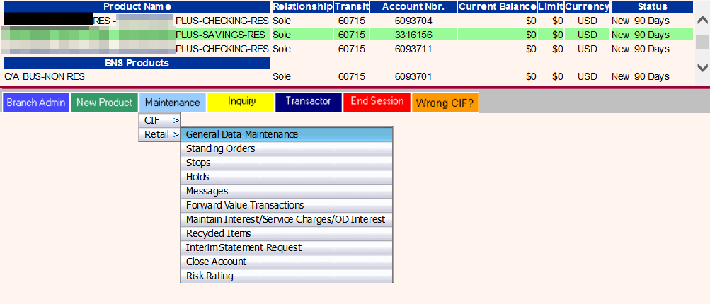
The old platform had two modes: inquiry and maintenance. Inquiry meant viewing the information of an account without being able to edit it. While in Maintenance, you could edit the data but not see all of the information.
For example, if you wanted to see the information of an account, you had to go into inquiry mode. Then, if you wanted to edit something, you had to exit the inquiry, return to the account list, re-select the account and enter maintenance mode!
We assumed that this back-and-forth between modes was a source of friction for PBOs due to the unstable nature of the platform, which was confirmed during interviews.

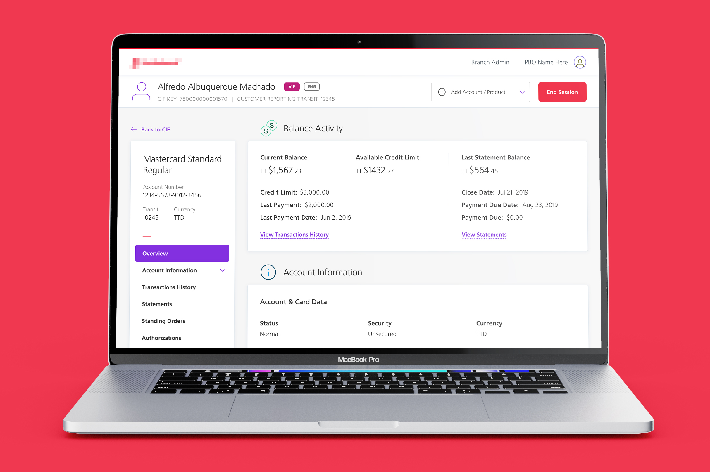
As a solution, we centralized the information and introduced a card system with editing modals that would overlay the inquired information. With this straightforward view-and-edit interaction model, users do not lose track of the context and can quickly update the account information. We also preventively indicated which data was editable or not.
Design system
When I joined the team as the second designer, my first initiative was implementing and managing a design system UI kit in Sketch. This allowed consistency across our design files in a centralized manner.
It turned out to be very helpful when we learned that the bank had started building its own overarching design system. Thanks to the UI kit, we managed to stay aligned with the bank’s design team when they pushed new updates.
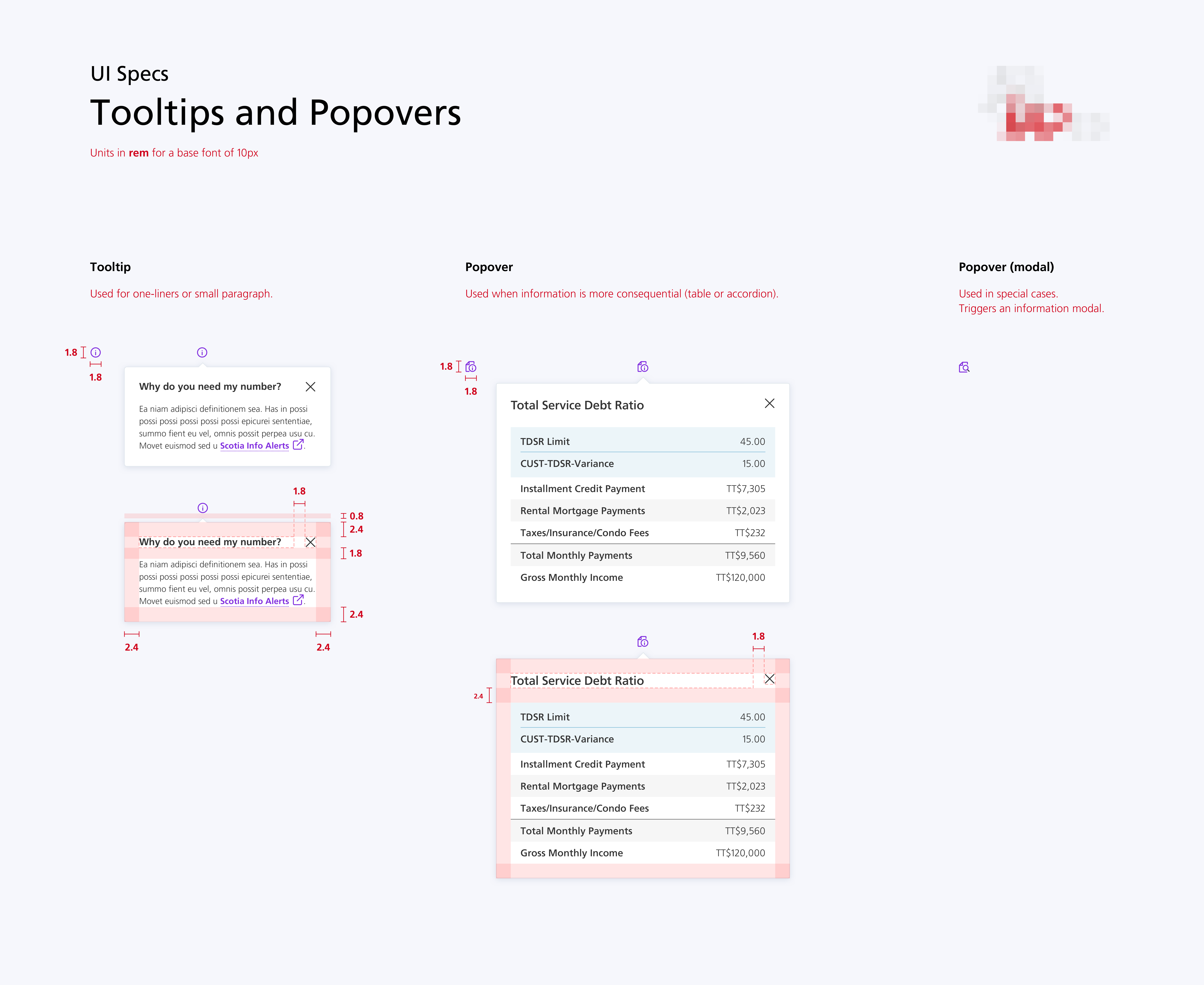
On top of the design system, we created UI specifications sheets for developers.

Over the course of the project, we designed hundreds of screens and dozen of prototypes for presentation and handoff delivery.